JR Chronicles – Saatchi Gallery

A few days ago I went to an exhibition in the Saatchi Gallery, where I saw JR: Chronicles. In the exhibition I got to see many of JR's projects, but not all of them (sadly). I got to see in total 13 projects of his.
JR is an artist who makes large scale photographic murals all around the world. The Saatchi Gallery displays films, videos, photographs and murals, of JR's work.
JR is an artist who makes large scale photographic murals all around the world. The Saatchi Gallery displays films, videos, photographs and murals, of JR's work.
The start of his intriguing career
|
JR was a 15 year old graffiti artist, when he found a 28mm lens camera in the Paris metro. This was the starting point of his photographic career. He started to document and photograph his graffiti he made with his friends, then gave them photocopies of the photos he took. And at 17 started to paste his work up in the streets of Paris, where he framed it with graffiti to not confuse the public if they thought it was advertising. In his 2011 TED talk he said, "the city is the best gallery I could imagine."
|

|
My Favourite Projects of his
|
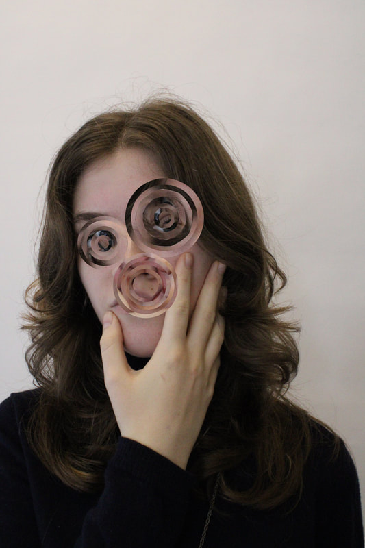
Face 2 Face
This project was his biggest illegal art exhibition ever. He photographed Israelis and Palestinians who had the same job, and pasted their photos right beside each other, to decide if they are actually different to each other. JR decided to paste the images in eight Israeli and Palestinian cities. He did this project to show everybody that Israelis and Palestinians are not different at all, and there shouldn't be any conflict between them. When the people on the street asked JR what he was doing, he would explain and then ask them to tell him which portrait was of an Israeli and which one was the Palestinian. They went silent, looked dumbfounded and confused. This shows that JR made a big statement to show that they aren't different at all. I really like this project of his. I like that he wants to know the truth so he actually travelled all the way there, which was his first time actually doing a project outside of France. I also like that this gives an impact on the people in both countries, they say the same things about another, such as 'they won't allow you to take a photo of them JR', but now they can see that they are very similar to each other. He shows them as "real", private people who are having fun, being goofy and just normal. The Wrinkles of the City The Wrinkles of the City project started in 2008 in Cartagena, Spain. JR was invited to the Festival of Music and the people told him that he doesn’t have to take pictures or do anything with the festival but can just do something in the city. JR found that Cartagena had so much history and past. He saw the duality of the old and the new architecture and then looked on and focused on the old people of the city. He liked that they had such beautiful wrinkles from the sun and started pasting big murals onto almost demolished buildings that also looked like they had wrinkles and had cracks in them. JR did this project in five other cities - Istanbul, Shanghai, La Habana, Los Angeles and Berlin over a few years. JR interviewed the elders he pasted, where they each told their stories. In JR's website it says, 'People who seem to have lost significance socially, the oldest generation, become visible once more and feel noticed and valued again.’. I like that JR connects age and beauty. He shows the city's eldest people, their past and history depicted by the old walls their faces are displayed on. In a way, he is letting them own their city. They look like beautiful with all their wrinkles. |


|
Workshop
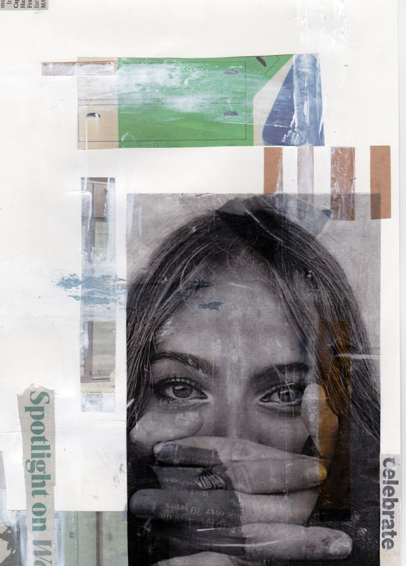
At the end of the exhibition I got to do a workshop. We first had to write down all the issues in the world that we know. I wrote, BLM, environmental issues, riots, poverty, world hunger, climate change. Then we had to write how we would display it though out art. I wrote: posters, murals, magazines, graffiti, statues and media e.g. magazines. Then we had to pick one issue (I chose BLM) and write a postcard to someone associated to that issue (this was inspired by the artist Ai Wei Wei), and also make a collaged image on the front of the postcard. The images below are what I did. I'm trying to show that we all have to stand together as one and be vigilant. Together, with compassion and love, we can eradicate racism.


Conclusion
So in conclusion I loved the whole exhibition. I thought it was amazing that the photographer took social issues and turned them into art. Art that is beautiful and gives the viewer joy, but art that has a message at the same time. Showing people from different countries that they should not hate each other. And showing young people that old people are just as important as they are. So, the viewer can enjoy the image itself but also gets to rethink and re-evaluate his views about the social issue that lies behind it. JR is trying to make the world a better and more peaceful place through his art.
JR: Portrait of a Generation
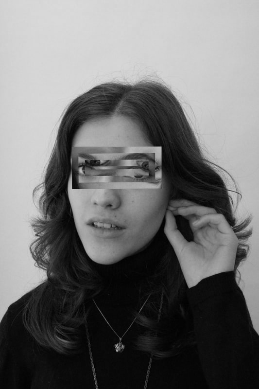
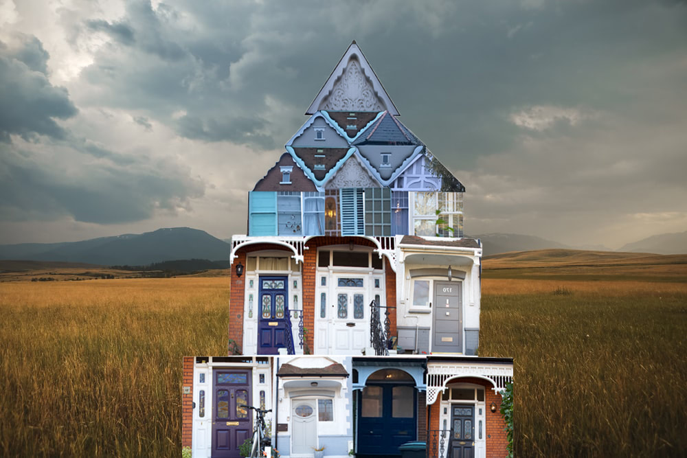
In this task I was set to take photos inspired by one of JR's first projects, named 'Portrait of a Generation'. The back story for this project is that in November 2005, the streets in the suburbs of Paris (Les Boquets) were burning because of the riots. JR saw on the news his picture he had taken a year before (of his friends). Which gave him an idea: He went to Le Boquets and took full portraits of the people who live there and of his friends. He took the photos with his 28mm lens camera, were you have to be as close as 10 inches away from the person your taking the photo of. This shows the person has to trust him in a way, and be comfortable with him. In my opinion I like that the person (he takes the photo of) has to be the one to consent and also choose which photo they want him to use.
When he took the photos of them he asked that person to do any expression they wanted, most of them did some sort of scary face "to play the caricature of themselves." (as JR said in his TED talk).
After he took the photos, he printed and pasted them in the bourgeois area of Paris, with that person's name, age and even building number. I think JR is very clever that he pasted them up in the fancy part of Paris and not the suburbs, it's very efficient way of showing that the people in Les Boquets are not just scary criminal rioting thugs. JR wanted to show a different side to the people involved in the riots, and also challenge stereotypes.
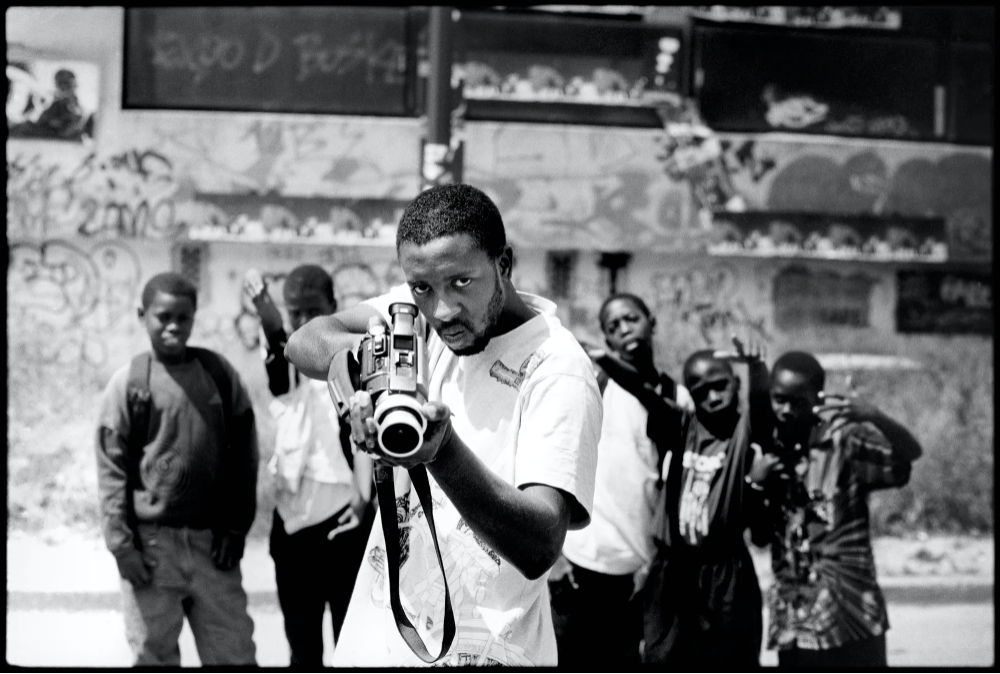
Photo JR saw on the news


So for this task I took 9 photos of my classmate (below), and allowed her to choose which image she wants to be pasted (just like JR). She chose image 3, she told me that the picture makes her eyes the key point of the photo and it signify's many of JR's works where he focuses on the eyes of the person he photographs. I went on the website Rasterbator to create my image into a large poster.
After that I went out to the city of London to take my photos. I tried to make my images look as natural as possible, as if the poster belongs there.
After that I went out to the city of London to take my photos. I tried to make my images look as natural as possible, as if the poster belongs there.
1.
4.
|
2.
5.
|
3.
6.
|
7.
|
8.
|
Image 3
In the website Rasterbator I chose the black and white dotted filter. After I got the print out I had to stick all 4 large papers together.

My Images
Favorite images


I really liked this task. It felt like I was JR in a way, I liked that people got curious of what I was doing. I think overall I did well in this task, I used shutter speed and also used triangles and layers from the composition types. If I could develop on this task I would have printed my posters even bigger and try the same task out. And/or I could take photos and there would be a story behind it. Like, I could do a series about people who lost their loved ones through Covid 19. Or about Europeans who had to leave London because of Brexit.
Image transfer
For my last JR relates piece of work was to do image transfer. In this workshop I had to cut out pieces of a newspaper and stick and collaged it onto A4 card. I wanted it to look neat. After that I got white acrylic paint and painted on the collages newspaper, to create an old perhaps rustic theme. Also with the white paper I stuck a piece of newspaper on it and held it there for around a minute, and as I took it off it left some pieces of the ripped newspaper. And lastly I had my JR image put sellotape onto the face side and flipped it over and started to rub away the paper with water. In the end there was just the sellotape with the print of the face and so I stuck it onto the A4 card.
I really enjoyed this small workshop and that I did something more practical and hand working. I like that what I created looks quite abstract, delicate and neat in a way. I think I have collaged the newspaper and image in a way to look neat and just organised correctly. Perhaps next time I can try out a more colourful image transfer.
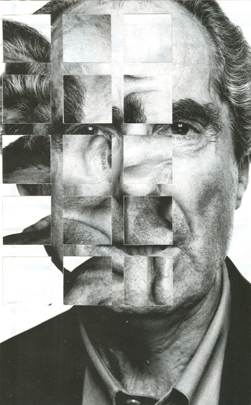
Gordon Magnin
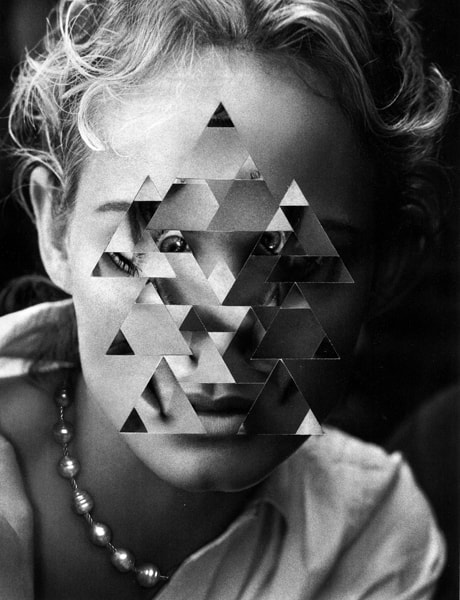
Los Angeles-based artist, Gordon Magnin, produces work that is a perfect response to his environment. Magnin lives in a city that is visually influenced by celebrity and Hollywood advertising. He creates images mainly of found female fashion photos and deranges their faces by putting geometric shapes on their faces. He does this mainly on Photoshop by either cutting them out of the images and replacing them on a new angle or even just by removing the shapes completely. He wants us to consider his past education in engineering and architecture, where you can see his use of geometric structure.
Magnin said in an article that he had amblyopia in his left eye which means he is blind in that eye, and it gives him a 'huge effect on depth perception'. This makes him see things in a different way. Perhaps this encouraged him in his work to alter peoples faces with shapes. I think he used shapes also as a key point in his work because he said that he was a perfectionist. This shows through his work because his images look quite neat even though the shapes are all over the place.
Magnin said: "I am interested in creating something that is outside of our normal existence. We are surrounded by all sorts of objects and images and we passively categorise these things. I think it is great when a piece of art or an artefact makes you stop, look, contemplate, and re-evaluate something that you thought you knew. I think this can come from many different angles, including inventive manipulation of images, odd juxtapositions, or anything that is just outside of our knowledge range."
Magnin's creations

My response |
|
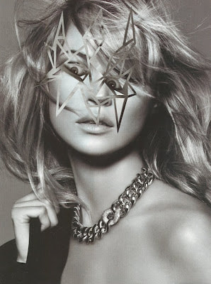
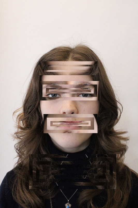
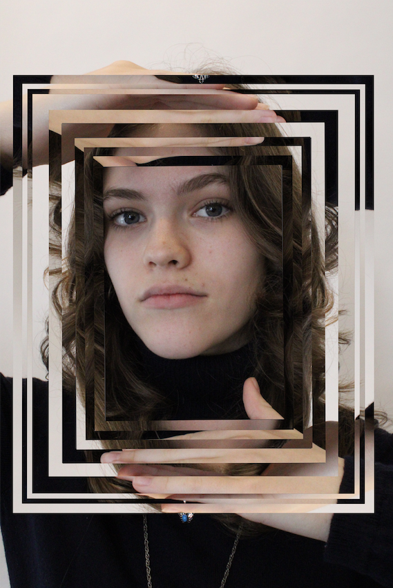
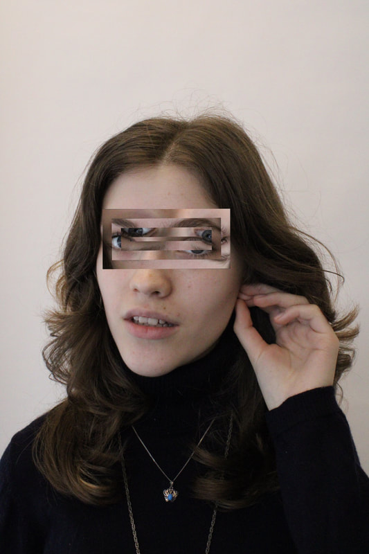
In this task I will take photos of my model and on Photoshop use the same techniques as Gordon Magnin, to create geometric shapes onto my model where they look unrealistic and odd.
Images I used
Photoshop explanation
Outcome
Final edits |
|
|
|
|
|
I think my work has similarities to Magnin's work and that I have used photoshop to create the same geometric shapes like his work. I like that the squares and rectangles look organised but still looks odd, it also looks like a boarder which is quite cool. It would be even better if I could try out different shapes on photoshop, for example a triangle or pentagon.
Fragments Half Term Homework
For this homework I was set to recreate the composition of a famous, classic painting. I used my mother as my model. I didn't want to really change the background for the photos but for the model I wanted herself to symbolise the painting. She copied the traditional poses in the paintings but there was a modern funky twist to it.
|
I first looked at the artist Tom Hunter and his series of work Persons Unknown where he takes photos of people where they have the same poses as the painter Vermeer's paintings. So then searched and found a painting by James McNeill Whistler called 'Whistler's Mother' and is also known as 'Arrangement in Grey and Black No.1'. I like that the painter was photographing his mother because I am too.
In my images I wanted to do the opposite of what Whistler's mother was wearing so I made my mother wear black instead of white (head dress and handkerchief) and white instead of black(dress). To the right is the painting. And below are my attempts in photo style. |
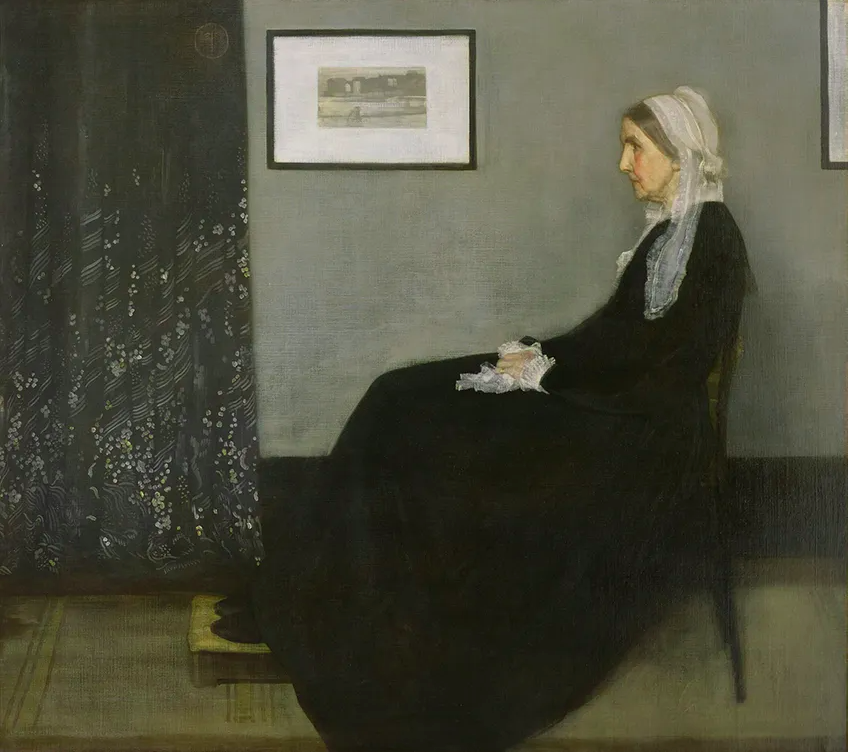
Whistler's Mother ,1871 |
|
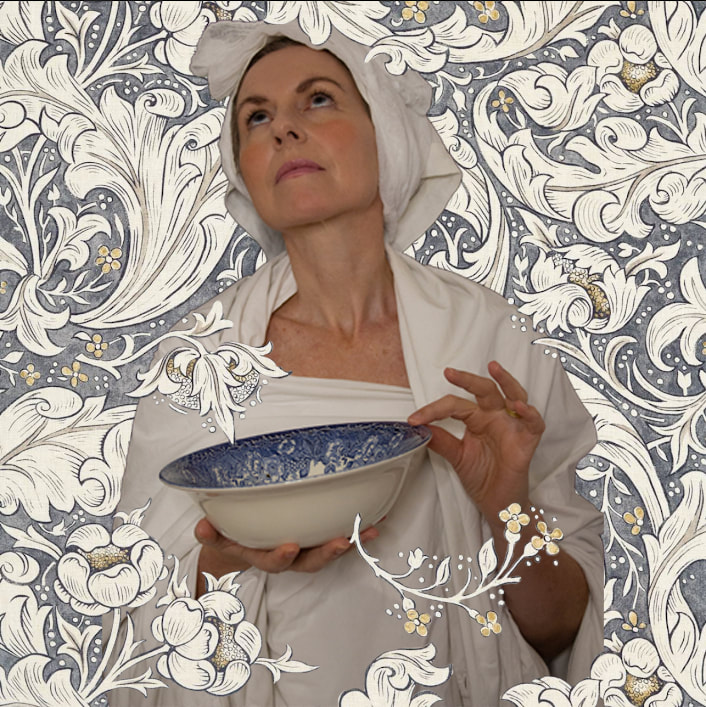
After James Whistler's work 'Whistler's Mother' I decided to switch to portrait paintings. And after looking at many different classic portraits I settled on this painting by Guido Reni called 'Portrait of a woman (Lady with a Lapis Lazuli Bowl)' (the photo on the right). I first found this painting significant because the model was rolling her eyes and so I thought there was some sort of story behind it. So then I searched up more of Reni's work and found out that in other paintings of his the model's also rolled their eyes, so I think it is some sort of trademark of his.
Below are my attempts in photo style. I wanted to use a beautiful bowl just like the woman so I found a white and blue decorative bowl to use. And for the robes I used a bed sheet and a cheese cloth for the head dress. Then I wanted to put a funny aspect onto the photo, so instead of the bowl I switched it with a cabbage. This reminds me of when viewers look at famous paintings and then make memes about them, for example editing a moustache on The Mona Liza. |
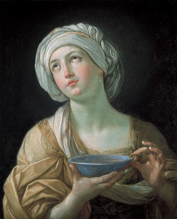
Portrait of a woman (Lady with a Lapis Lazuli Bowl), 1638–1639 |
|
My third choice was to use a very well known painting 'Girl with a Pearl Earring' by Johannes Vermeer (on the right). I picked this painting because I like how delicate and alluring it is, it makes the viewer just take a deep breath in and calm down.
I decided on taking three sets of photos for this painting. I chose to do a colour concept for one set of photos, which was a pink and purple mixture (I did this especially because on the day I took the photos it was Breast Cancer awareness day, where you wear pink). And for the other two photos I carried on with the funny concepts like bad motorcycle woman and woman wearing a bathrobe. Below are my unedited images. |
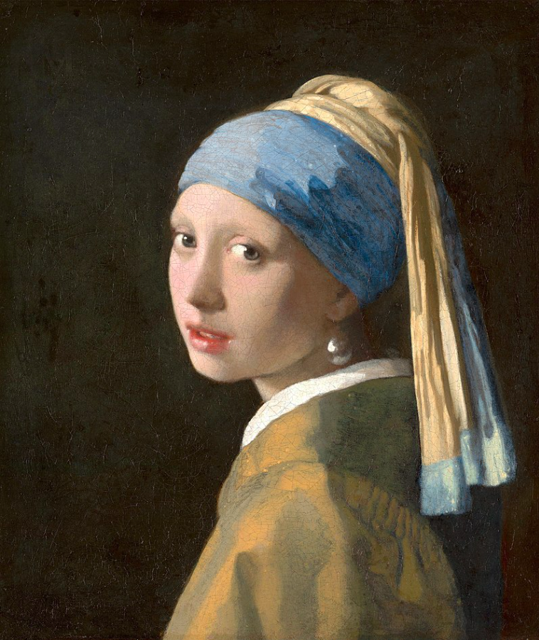
Girl with a Pearl Earring, 1665 |
Final edited photos

Lady with a Green Cabbage, 2021 |

Portrait of a woman (Lady with a Lapis Lazuli Bowl), 1638–1639 |

Woman with a Turquoise Earring, 2021 |
Girl with a Pearl Earring, 1665 |

Saul's Mother, 2021 |

Whistler's Mother ,1871 |
Overall I really enjoyed this task, especially that I could have my own thoughts and use them through the task. I think my lighting went very well, I also used a tripod which really helped with keeping the camera still. But it was difficult to get a painting effect in my images. Next time I could use natural light instead of artificial lighting for the 'Saul's Mother' image, because there is quite of a harsh lighting.
Kehinde Wiley
Kehinde Wiley is an artist who recreates classic paintings from an older time period. He provokes questions and challenges stereotypes for example using only black people in his paintings where he wants to reclaim their identity. Through Wiley's paintings he wants to present their persons stories, and he also celebrates the individual in his work.
Wiley finds his models by asking black people on the streets of New York if they want to be painted. Wiley has a big folder of classical paintings and he asks the model which pose they want to recreate, this shows this is all the models choice and they get to choose however they want to be presented (this reminds me of the artist JR asking his model's before he photographs them, and lets them choose whichever face they want to make) The chosen pose is very important because it allows the person to present theirselves in a powerful way. Below is a a piece of Wiles work and its corresponding painting.
Wiley finds his models by asking black people on the streets of New York if they want to be painted. Wiley has a big folder of classical paintings and he asks the model which pose they want to recreate, this shows this is all the models choice and they get to choose however they want to be presented (this reminds me of the artist JR asking his model's before he photographs them, and lets them choose whichever face they want to make) The chosen pose is very important because it allows the person to present theirselves in a powerful way. Below is a a piece of Wiles work and its corresponding painting.
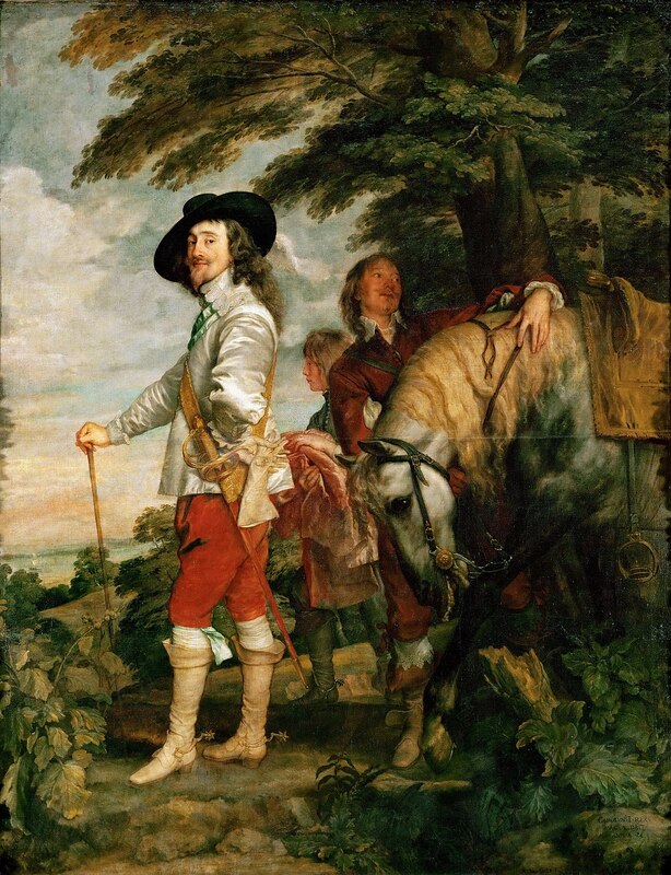
Le Roi á la chasse (Charles I at the hunt), 1635 |

Le Roi a la chasse, 2006 |
Here is Anthony Van Dyke's Le Roi á la chasse (on the left) and Kehinde Wiley's Le Roi a la chasse (on the right). As you can see the similarities are that they both are men; have facial hair; are wearing casual clothes; are doing a powerful pose and are looking down on the viewer. It's also quite interesting that they both have the same title, it seems like Kehinde Wiley is giving the same title to show that the person he painting is as important than King Charles I. Another thing is that Charles I's horse and even the trees are bowing down to him which shows his power whereas the black man has a tattoo on his arm which says "God is with me" which implies that there is a higher power that is with him and that he acknowledges.
The differences of the paintings are that Van dyke's painting looks more realistic than Wiley's painting, their timelines are different. Also their races are different which is showing whatever race you are you are still as powerful as a king. Another thing is that Charles I's horse and even the trees are bowing down to him which shows his power whereas the black man has a tattoo on his arm which says "God is with me" which implies that there is a higher power that is with him and that he acknowledges.
The differences of the paintings are that Van dyke's painting looks more realistic than Wiley's painting, their timelines are different. Also their races are different which is showing whatever race you are you are still as powerful as a king. Another thing is that Charles I's horse and even the trees are bowing down to him which shows his power whereas the black man has a tattoo on his arm which says "God is with me" which implies that there is a higher power that is with him and that he acknowledges.
My response
So in this task I was set to use my photos from the task before. I had to transfer one of my images onto photoshop and also find a patterned painting (for example William Morris), lay my model on top of the painting and make the out come look like Kehinde Wiley's paintings.
Below are steps on how I did the photoshop work.
Below are steps on how I did the photoshop work.
Final Photoshop images
Favorite edit
I found this task very fun! I like that my final pieces look almost like paintings. I think choosing parts of the background to put above the model was the best thing I achieved. To develop on this task I could perhaps find painting related to the model.
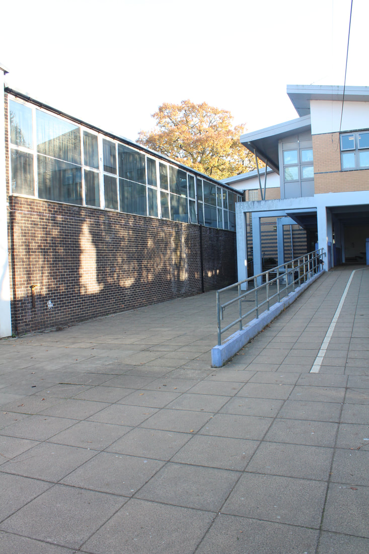
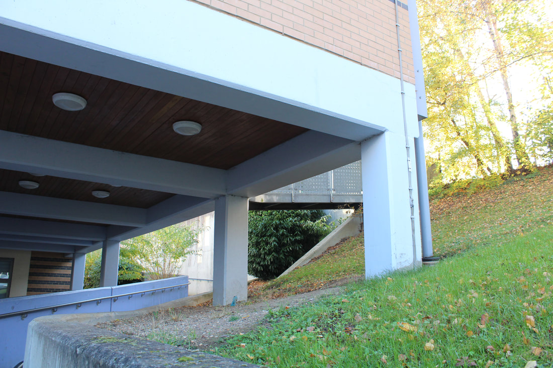
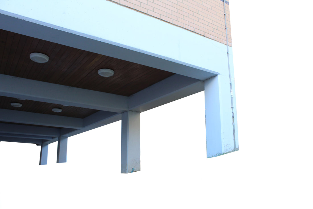
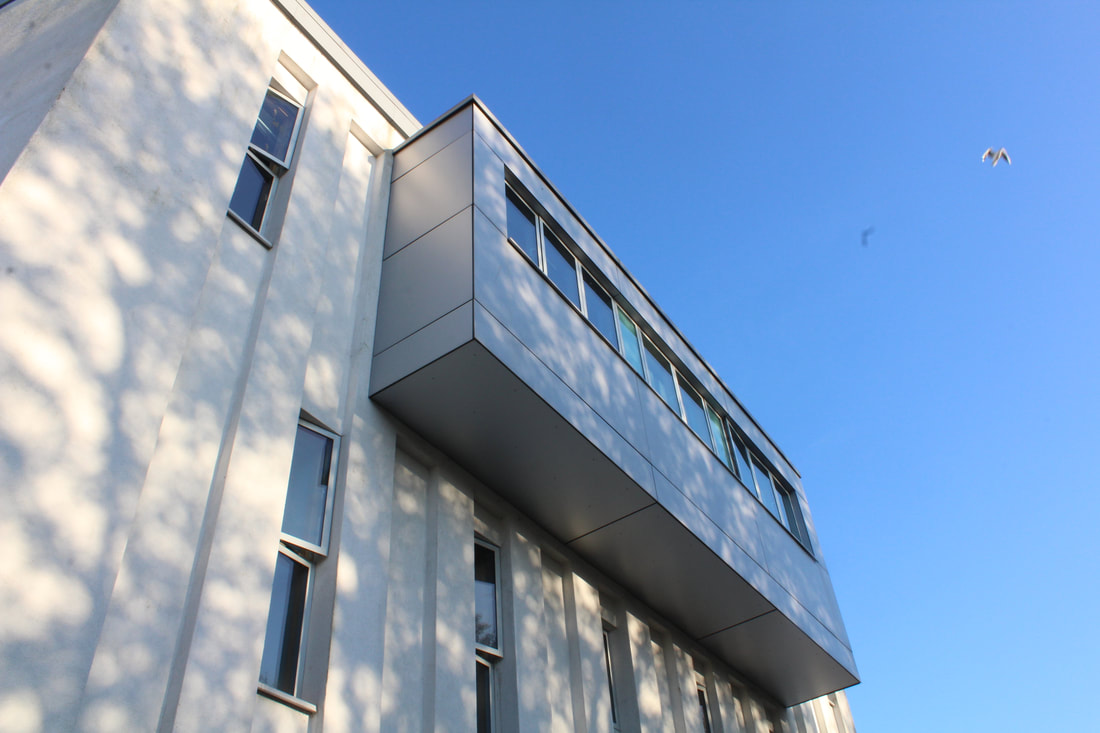
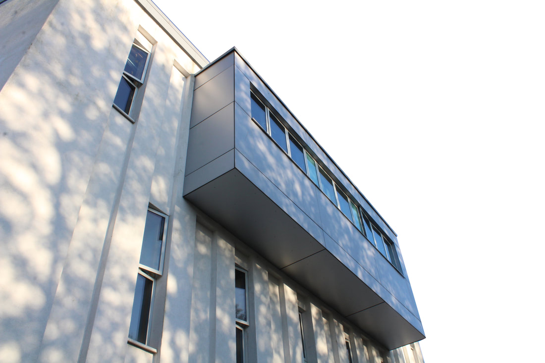
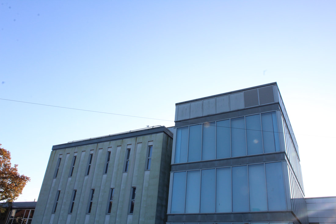
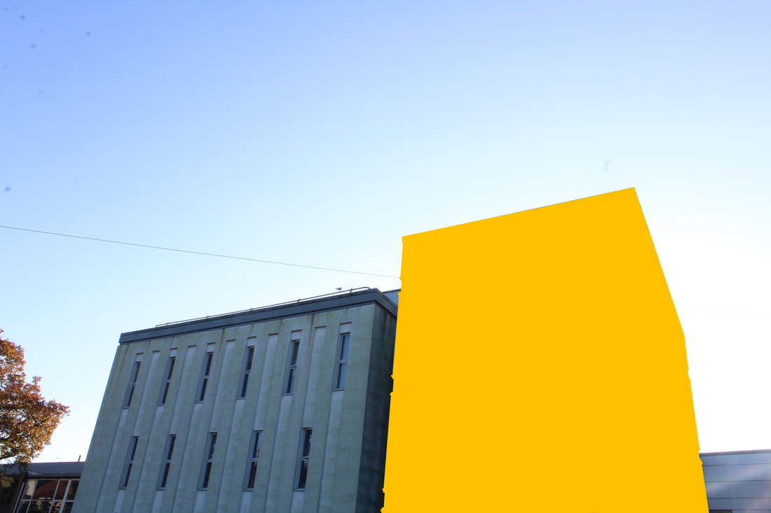
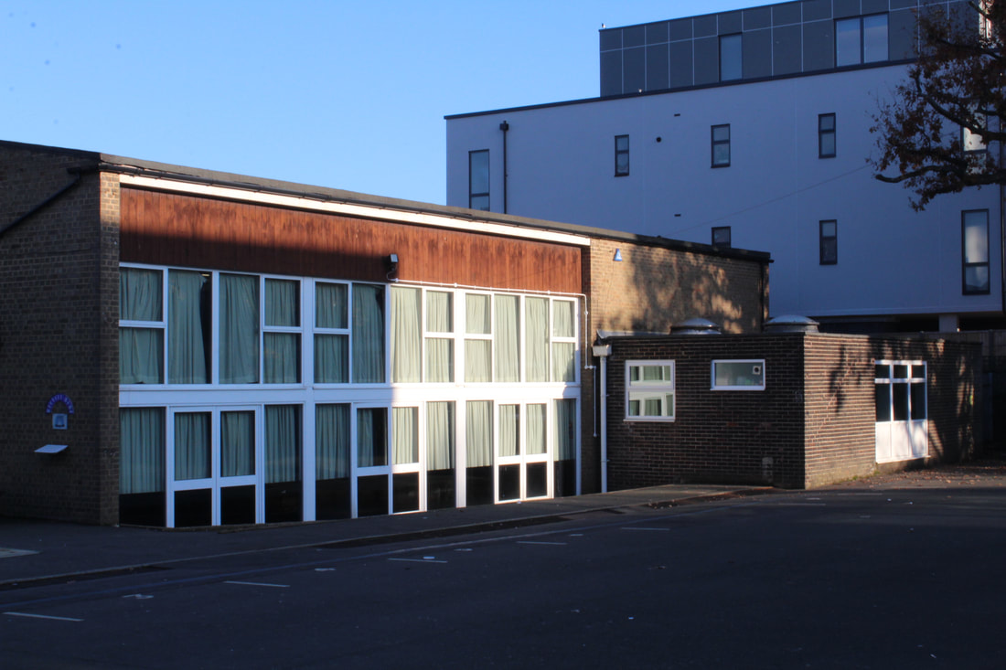
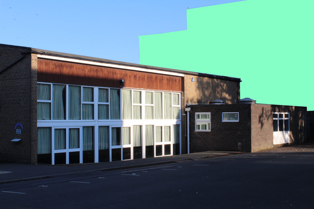
Fragments of Buildings
Task 1: Patrick Cornillet
In this series from the painter Patrick Cornillet, he painted architectural elements isolated from their environment and reconstituted in the form of objects on a white background. To me it looks like he is showing the actual beauty and hard work of people who create these buildings.
The concrete makes us aware of the material and of the remains left by the humans and of time passing by.
Even if the architectures seem uninhabited and dehumanised, Cornillet creates a particular poetry and a mesmerising mysticism.
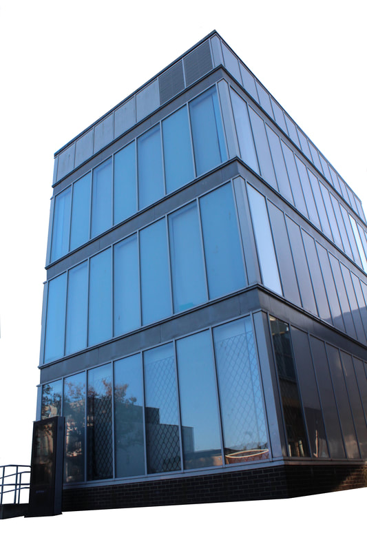
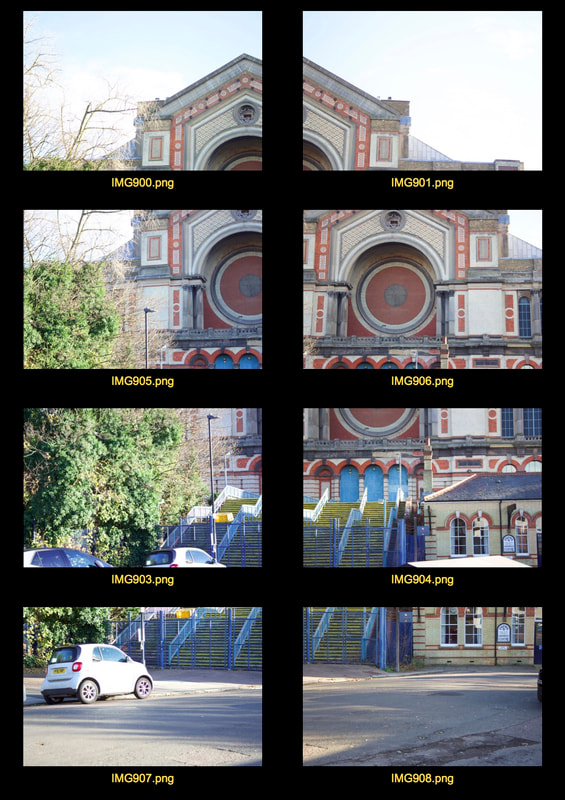
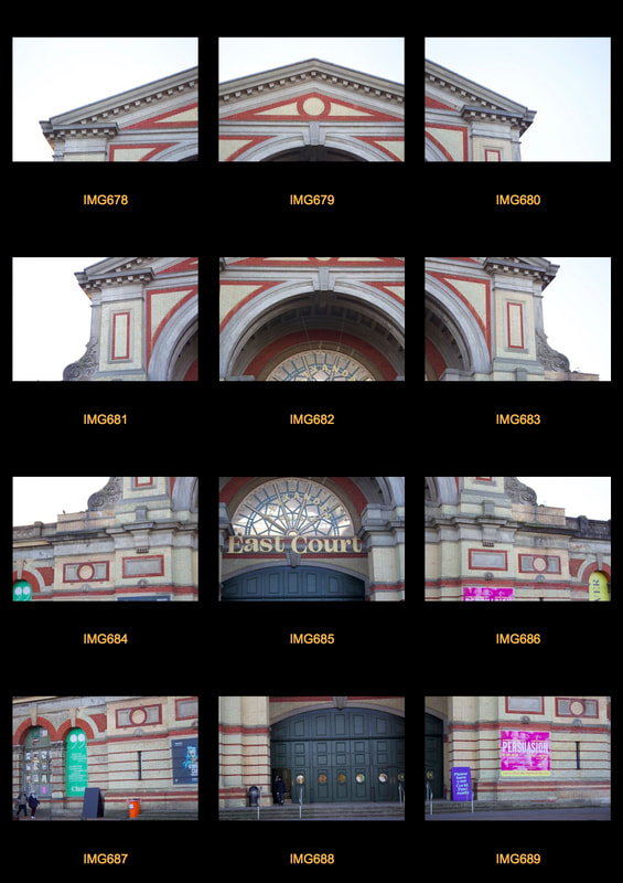
And so in this task I had too do the same thing as Patrick Cornillet but using photography and photoshop. So I had to take photos of buildings with no people in the image. And then photoshop all the unwanted space and turn it (the background) into white.
The concrete makes us aware of the material and of the remains left by the humans and of time passing by.
Even if the architectures seem uninhabited and dehumanised, Cornillet creates a particular poetry and a mesmerising mysticism.
And so in this task I had too do the same thing as Patrick Cornillet but using photography and photoshop. So I had to take photos of buildings with no people in the image. And then photoshop all the unwanted space and turn it (the background) into white.
Patrick Cornillet's art work


My photos
How I did it
Results
|

|
|
|
|
|

|
|
Extension
Patrick Cornillet's artwork
In some other works of Patrick Cornillet he paints a sky behind the building, perhaps to create a scenery around this vast space.

|

|
My work
I chose to try out the sky and then I thought I should also do a night sky version.
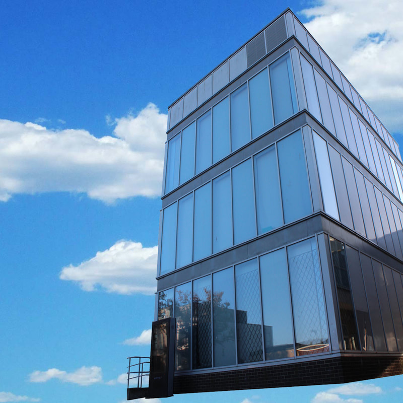
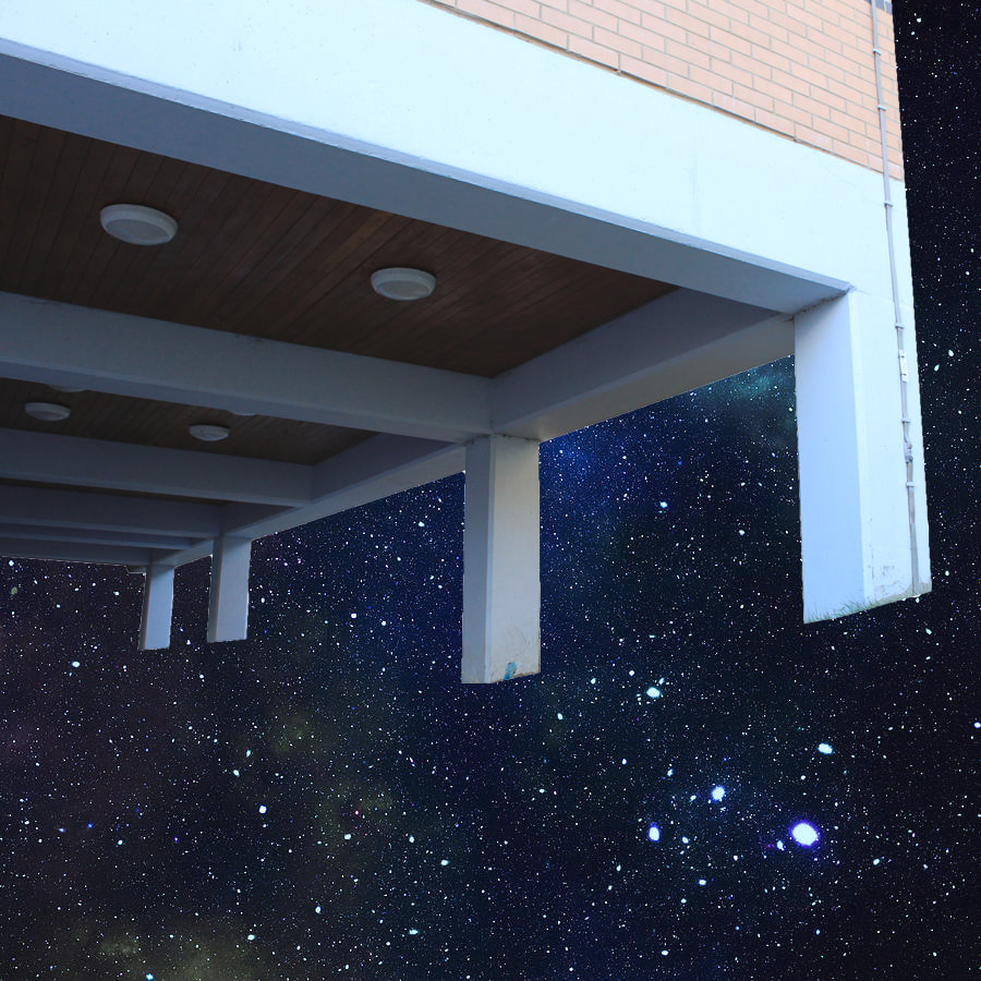
I liked this task especially the extension. I like the power I had to put a building in the sky. I think the editing on photoshop I did went the best. To improve this perhaps I could go out to the centre of London and photograph famous buildings, rather than normal buildings.
Task 2: Mauren Brodbeck
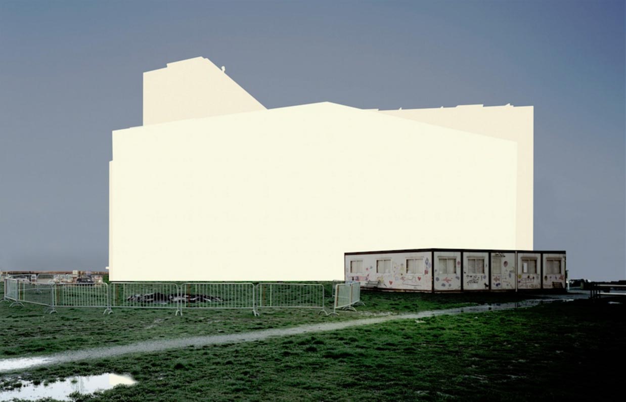
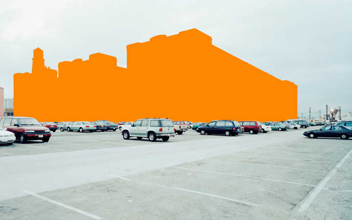
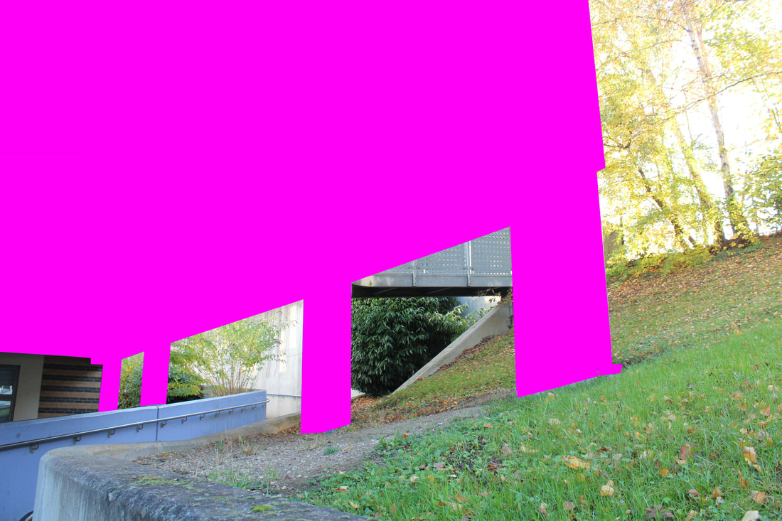
Mauren Brodbeck is a photographer who photographs buildings and car parks, and fills it with a bold colour. She is showing the buildings are what a passerby would not enter in their thoughts. This leaves a mental blank for them.
The buildings are so unimposing that their existence seems almost doubtful.
I like that Brodbeck registers these buildings and changes them into a visual moment representing space and time.
So in this second task I had to do the same. Firstly use the pictures of buildings then select the whole building (not the outside of it) and colour it in.
Mauren Brodbeck's work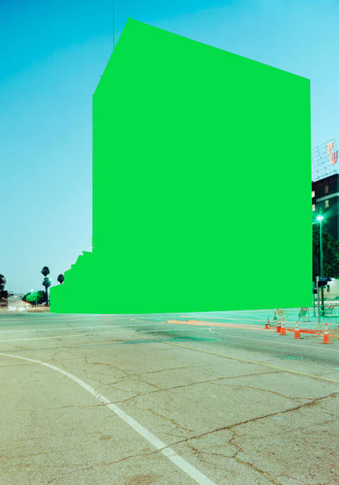
|
|
How I did it
My attempts
|
|
|
|
|
|
|
I think I chose the best colours for my final images. I also think I edited it well using the polygonal tool. To improve I could take images of buildings in the city, which I would think look cooler.
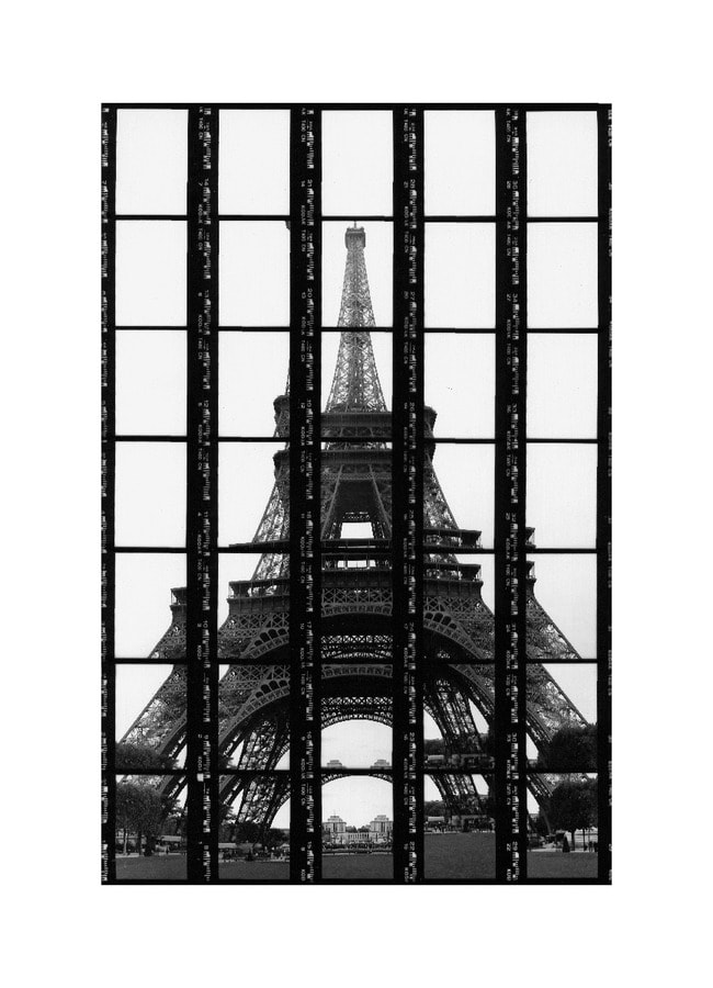
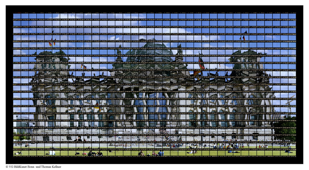
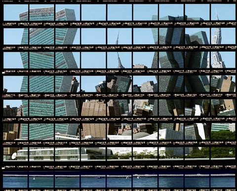
Task 3: Thomas Kellner
Kellner's work shows us segments of the total which come together as one image. His photographs do not necessarily deconstruct architecture but instead reconstruct our view of it. His work offers an alternative view of famous landmarks, one that intends to question our thoughts on how we visually process them and develop a sense of place.
Kellner uses the traditional process of film photography to create montages. Using just one roll of film, Kellner often takes images of the same landmarks or buildings of significance from different angles to later re-arrange them on a contact sheet and create a unique composition. The way he sets up his photos reminds me of the photo joiner task I did in Domestic Objects and spaces.
Kellner uses the traditional process of film photography to create montages. Using just one roll of film, Kellner often takes images of the same landmarks or buildings of significance from different angles to later re-arrange them on a contact sheet and create a unique composition. The way he sets up his photos reminds me of the photo joiner task I did in Domestic Objects and spaces.
Kellner's work
My attempt
So for my task I had to do the same thing as Kellner. But instead of using film I used photoshop app called 'Bridge', and joined my photos there.
How I did it
Images I used
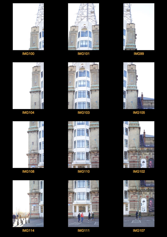
In this task I successfully used this new app without any mistakes which I am pleased about. Next time I think I could take more photos around the building I was photographing, so it would look more like Kellner's work.
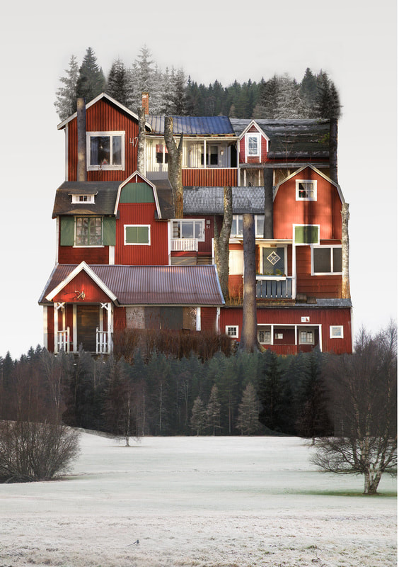
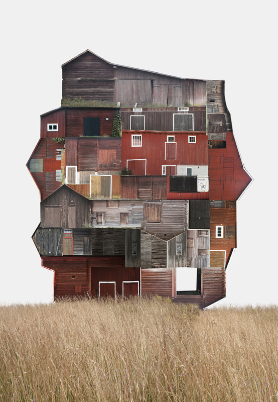
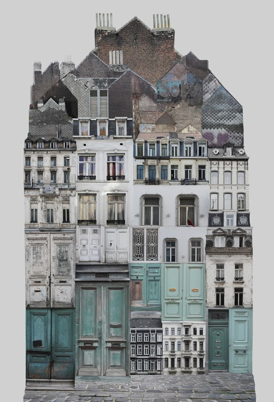
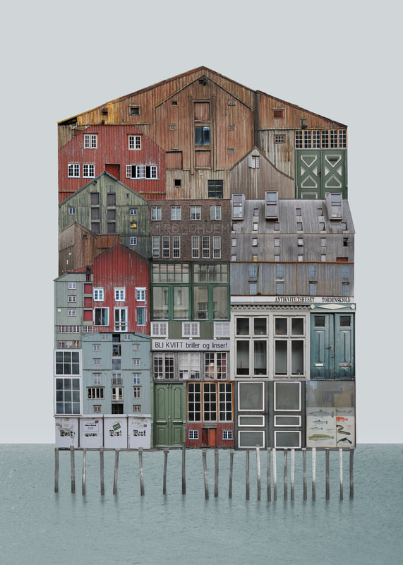
Task 4: Anastasia Savinova
Genius Loci (her project) explores the character and the spirit of a place. Each work is composed of numerous photographs of buildings and landscape forms that are specific to an area. These works balance between documentary and fiction, factual and imaginary spaces, and become keepers of the memory and the spirit of the place.
|
|
My attempt
Inspired by Savinova I also created somewhat the same thing she's done in her project 'Genius Loci'. I photographed facades of homes, of where I live. And then I cut, edited and joined each part of each house to create a complete new house.
How I did it
My photos
Final edited photos
I went one step further by adding a background to the photo, Savinova does this in some of her images.
The background image was used off the internet.
The background image was used off the internet.
Editing on each part of the house and layering it out was the best thing I achieved in this task. To improve I could use my own photos for the background.
Independent Development:
Strands
First Strand
Malick Kebe
Matick Kebe is a photographer and curator putting Abidjan (a city on the southern Atlantic coast of Côte d’Ivoire, in West Africa) on the creative map through bold, high-contrast images filled with energy. Kebe uses his phone instead of a camera and uses Photoshop, Lightroom, VSCO and Snapseed to edit. Through iPhone photography, Kebe “builds a universe that mixes modernity and African origins.” He notes, “even if I had the means, I would still shoot on iPhone. It pushes me to go further than with a pro camera. I want to show people that it’s not enough to have a great device, but it is enough to have a creative eye.”
Kebe has a strong understanding of shape, colour and concept, telling evocative stories with minimal subjects and small production.
https://aestheticamagazine.com/high-contrast/ https://africarty.com/artists/malick-kebe/
Kebe has a strong understanding of shape, colour and concept, telling evocative stories with minimal subjects and small production.
https://aestheticamagazine.com/high-contrast/ https://africarty.com/artists/malick-kebe/
My attempt
For this first strand of mine, I will be photographing in Matick Kebe's style. I will also be using a phone intead of a camera.
As I was doing this task on my own (with a phone tripod) I had to edit on some of them, because it was difficult to tell if I was in the middle. The pink and red background is A1 card and next to that was the actual wall. I used photoshop to take out the tiles and make it only the vibrant colour.
Best edits


I really enjoyed this first strand, I like that it was a little challenging to take photos of myself without any help. The whole process was enjoyable for me. To develop on this I could carry on with the concept of colours and portraits. I could use colourful lights on the model.
Second Strand
Daniel Crooks
Daniel Crooks works predominantly in video, photography and sculpture. He is best known for his digital video and photographic works that capture and alter time and motion. His work creates slippages between visual perception and temporal experience. He uses two images and splits both in thin lines, so every second line is the same image.
https://ocula.com/artists/daniel-crooks/
https://ocula.com/artists/daniel-crooks/
My attempt
I went to largely populated areas to take my photos.
How I did it
Edited images


I liked that I took charge in this second strand in the photoshop area. I didn't have a teacher to explain how I had to layer each strip but I just thought of a way a sticked to it. I also liked the contrast of some of my edited images that were set in the afternoon where it was light outside and in the evening where it was darker. If I would develop this I will carry on with the night and day concept and take photos of the same place at different times of the day.
Third strand
Nicholas Kennedy Sitton
Nicholas Kennedy Sitton is a photographer who takes photos of buildings and edits them to make those buildings look rotated. Some selections of the buildings have been rotated making the scene look like it’s spiralling into itself. These distorted buildings remind me of the photographer Gordon Magnin who does a similar thing to people.
Sitton leaves much of the original image untouched. To me his images look like the movie 'Inception', it all looks so confusing and out of this world.
Sitton leaves much of the original image untouched. To me his images look like the movie 'Inception', it all looks so confusing and out of this world.
My attempt
I took photos of architecture just like Sitton.
How I did it
Edited images


I enjoyed editing the photos how I wanted it to look like. To improve my images I should edit the brightness and colour balance before applying the twisted technique.
Strand 1-
First Development
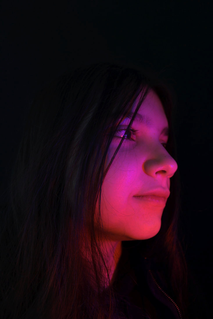
My favourite strand was the first strand. So I will carry on exploring colour and portraiture. In this first development I will be taking my photos inspired by the artist Petra Collins. I will use dark coloured backgrounds with different coloured lighting on top of the models face.
Petra Collins Work
Unedited photos
Firstly I had to turn off all of the lights in the room. Then I used torches and placed coloured acrylic panels onto the torches, this was to give off the coloured lighting.
I used the most suitable/ fitting colours on my model face so that my images would have the best outcome and look appealing to the eye. For her poses I instructed her to have a dreamy like face, which creates a feeling of being lost and absent. The colours could also show what here emotion is at that moment.
Edited photos
In these final edited photos I went on photoshop to increase the vibrance and darken the background more. This makes the models face stand out more, and we are really drawn to the expression on her face. The colours that are tinting her face make the model look mysterious and melancholic.

|

|
|

|
I like how the colours on my models face really fit and blend together. Also I like that I could darken the image more to make the background look more eerie. Perhaps to make this first development better I could go even closer to the models face and take photos.
Second Development
Continuing on with this colourful lighting portraiture, I tried out something similar. Inspired by the artist Mads Perch, I photographed my model in front of a projector with interesting patters projected on top of her.
Mads Perch's work
My attempt
I chose these specific patterned images because I wanted to try out a range of different patterns on her, to see what fit on her face. The colour projections combined with the neutral expression of my model make her look humanoid, but without a soul. She could be a robot or an android.
The idea was to take the human out of the human.
The idea was to take the human out of the human.
Edited images
I specifically chose these images to be edited in photoshop because I think these photos had the best angles of the projections on my model.
I think my audience would find that the colours would be intense and almost blinding as it all looks very dizzying and psychedelic, as I have increased the vibrance. But would still look captivating through the expressions on the model's face.
Adding on to that I feel that I have created a feeling of unpredictability through the model. There are questions of: What is she going to do? Is she dangerous?


I really enjoyed this development. I like that my model looks like she's a mannequin/ robot with no soul. My images express my intentions of creating a humanoid, with beautiful projected patterns.
There is a discrepancy through the colours which associates with party and happiness and the facial expression which is serious and the total opposite of happiness.
In my next development I want to take more photos of my model infront of projections.
There is a discrepancy through the colours which associates with party and happiness and the facial expression which is serious and the total opposite of happiness.
In my next development I want to take more photos of my model infront of projections.
Third Development
For this next development I will be photographing my model inspired by the photographer Johanna Reich. Johanna Reich photographs 'normal' people behind a projection of a famous celebrities. This project of her's is called 'COULD BE HERO(IN)ES JUST FOR ONE DAY'.
I like this prodject of her's. The way I grasp this prodject of hers is that she is showing that we see these perfect beautiful famous people and we crave to be like them but we never quite manage to be as perfact as we percieve them to be.
I like this prodject of her's. The way I grasp this prodject of hers is that she is showing that we see these perfect beautiful famous people and we crave to be like them but we never quite manage to be as perfact as we percieve them to be.
Johanna Reich's work
Photos of celebrities I used
I used a range of old and modern celebrities in this photoshoot.
My Attempt
In some poses my model tries to shield herself by putting their hand over their face or covering themselves with their arms, but the image of the celebrity still projects onto them. I am attempting to show that my model is trying to be just herself, but she cannot escape.
Sometimes the image of the famous person is projected directly onto the models face which has an eerie, almost ghostlike effect. Questions would be asked like: Who is this person? She is only partly herself, the other part is who she wants to be.
Sometimes the image of the famous person is projected directly onto the models face which has an eerie, almost ghostlike effect. Questions would be asked like: Who is this person? She is only partly herself, the other part is who she wants to be.
Edited Images
I chose these three images to be edited because they have a noir quality to them and they are mysterious. To me, they show what is going on in my models mind. Where my model is feeling uneasy because she wants to be as perfect as the star she admires, but she feels that this is an impossible task
For the first image I really liked the goose bump feeling towards it, where everything just doesn't look correct. For the second image I like the composition of the image which is layers. I also liked that I managed to keep both faces in focus (where one is meant to be out of focus) by using manual focus. And for the third one I also like that it looks creepy but I know that if it wasn't so blurred it would've looked better.
For the first image I really liked the goose bump feeling towards it, where everything just doesn't look correct. For the second image I like the composition of the image which is layers. I also liked that I managed to keep both faces in focus (where one is meant to be out of focus) by using manual focus. And for the third one I also like that it looks creepy but I know that if it wasn't so blurred it would've looked better.


I really liked how the images of the celebrities projected onto my models face. Especially the pictures of the celebrity exactly on my models face.
I like the true story myself and Johanna Reich are trying to show. That we strive to be like famous people but we feel incomplete and frustrated because were just normal people.
It would be even better if the projections were better quality, because it would make my photo's better. Maybe for my next development I should make it more specific to the model. As in find a younger photo of them and project that onto their face.
Fourth Development
In this third development I will be projecting a younger image onto of my models face. This will be more personal to myself as a photographer and less like another photographer that I get inspiration off of.
Child photos of my models
I asked my models to give me photos of themselves as children. They have a part of this project.
My attempt
The idea behind this project is that we are a product of all of our experiences. My models were once the children in the photos, and they still carry the experiences they had back then as memories within themselves. Part of them is still that child. By projecting their child image onto their current faces I feel I am giving my audience a glimpse of the soul of my model.
I tried out a few different approaches. In one series, I asked my models to have a serious expression. Their child images, however, look happy. I found the results really compelling. To me it shows how we try to carry an image on the outside that does not actually reflect who we really are on the inside. We may try to look strong and grown up, but in reality we are feeling vulnerable and small.
I tried out a few different approaches. In one series, I asked my models to have a serious expression. Their child images, however, look happy. I found the results really compelling. To me it shows how we try to carry an image on the outside that does not actually reflect who we really are on the inside. We may try to look strong and grown up, but in reality we are feeling vulnerable and small.
Unedited images
After this I tried out something else. I asked one of my models to make the same happy face as in the picture he gave me. The two images are morphing into each other and I feel it shows the journey of the little boy he was back then to becoming the young man he is today.
When you put the happy expression and the serious expression images next to each other, the result is quite interesting to me. The happy image simply shows the transition from the child to the young man. The image where the model has the serious expression also makes the viewer think about how difficult it is to grow up and become an adult, it talks about something we may loose or forget on the way: our innocence and sometimes our happiness. These things are still within us but they are like out of focus projections, faded and almost ghostlike.
When you put the happy expression and the serious expression images next to each other, the result is quite interesting to me. The happy image simply shows the transition from the child to the young man. The image where the model has the serious expression also makes the viewer think about how difficult it is to grow up and become an adult, it talks about something we may loose or forget on the way: our innocence and sometimes our happiness. These things are still within us but they are like out of focus projections, faded and almost ghostlike.

|

|
Edited images


In my third series (below), I matched the image of the child as directly on the features of the model as possible. This is some thing I already explored in Development 3 where I projected the celebrities photo directly onto my models face. I like this concept as it is quite disturbing. At first glance you realise there is something wrong with the face your looking at, but you cant quite grasp what it is. When you take a closer look you realise that there is a face on a face. To me these images are like they are straight out of a nightmare. The models expressions are calm, which makes you freeze because you expect something bad to happen any second. It puts you on edge.


I really like the lighting i'm my photos, I like that my edited images are sharp and in focus. I also like the expressions on my models faces as they look like they have a lot on their minds, as if they are remembering their childhood. It would be even better if I could have the child photos of my models more in focus, as this development is not in focus enough. And I want to make the background of my edited images even darker.
Retakes
In these retakes I have sharpened the child images. So you can see the images projected a lot clearer.
Edited images
I believe I was very successful for my final piece and my photos look professional. I am also glad that I retook my photos as it changed the quality of my photos and created a better outcome. I believe I don't need to develop further as my edited final images are the best outcome I can produce.
Final Piece


