Four Composition types
In this task I was supposed to take photographs of 4 types to compositions. The four are Balance, Rule of three, Triangles and Layers. Balance is objects in an image that has 'weight'. For example two objects can balance each other even if they are different to each other. Rules of three is when your image is divided into 9 equal segments by 2 vertical and 2 horizontal lines. Triangles are when you capture an image that has some type of triangular shape in it. And lastly layers is when you deliberately partially obscure one object with another which makes them overlap.
Below are examples of the four types.
Below are examples of the four types.
Balance
Layers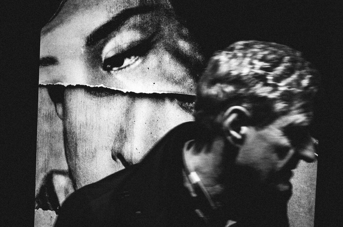
|
Rule of three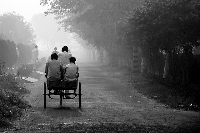
Triangle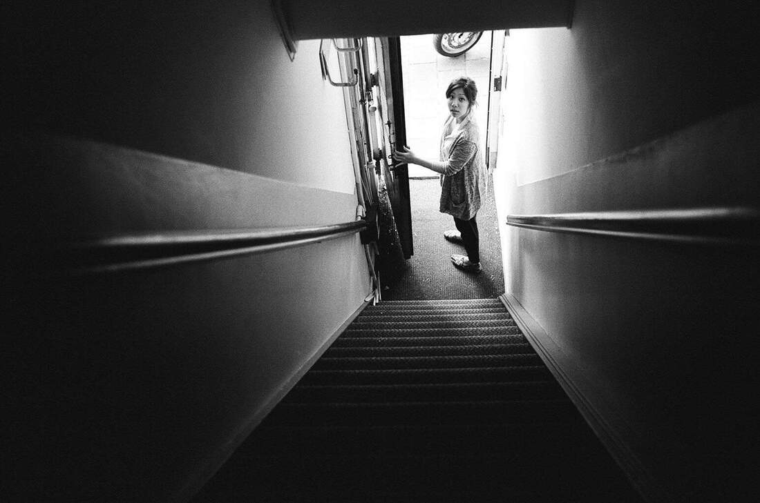
|
My Response
I made these small sheets of paper with examples of the 4 compositions. I had to use them as a template for my photos. They are shown below.
Balance

|
|
Rule of three

|

|
Triangle

|

|
Layers

|

|
WWW: I think my editing for the photograph was good. Because I feel like whenever I use photoshop I get better and better.
EBI: I could use a tripod in some of these images.
EBI: I could use a tripod in some of these images.
Framing
Using mirrors
Sebastian Magnani's Work.
|
In this task I was set to photograph scenery through a small mirror. This work is inspired by Sebastian Magnani. In Magnani's work he finds multiple examples of natural scenery. Sometimes he finds opposing colours in his photos. And in other photos are very similar.
I used 100 ISO because outside was very bright. The program was on TV settings and the shutter speed was 1/60. |

|

|
My attempt
Edited work

|

|

|

|
WWW: My reflections in the mirror contrasted to the background of the photo making it over all visual interesting.
EBI: Some of the images are overexposed so if I could take photoes another day that isn't so bright.
EBI: Some of the images are overexposed so if I could take photoes another day that isn't so bright.
Finger Frames
In this task I was required to photograph someones fingers and the scenery behind it. I used three different types of aperture for each photo which shows the depth of field. Depth of field is how much clarity there is in your photograph. There is either a shallow depth of field is when the background is completely blurred and you can only see the closest objects. And extensive depth of field is when you can see everything in the photograph.
Compared to my first aperture task on Toolkit I think I have gotten more better and confident in aperture, Depth of Field, as a whole. Here you can see clearly the amount of blur in each photograph.
Compared to my first aperture task on Toolkit I think I have gotten more better and confident in aperture, Depth of Field, as a whole. Here you can see clearly the amount of blur in each photograph.

Aperture: f/4
|

Aperture: f/11
|

Aperture: f/22
|
WWW: You can see in my three examples the different depths of field. I also used a tripod to prevent camera shake.
EBI: The lighting outside was very bright so it was quite hard to keep the photo at a normal brightness.
EBI: The lighting outside was very bright so it was quite hard to keep the photo at a normal brightness.
Framing Details
For this task I was set to take photos of scenery through a cardboard frame. In my photos I have captured the frame and the scenery around it. I find this very cool because you can see that some objects are both inside and outside the frame.
WWW: Having stable photographs because of using tripods. Also having different depths of fields in the photos. I like that in some of the photos the branch is inside of the frame.
EBI: The location of my images weren't interesting enough, I would like to take photos of some other objects instead of just leaves.
EBI: The location of my images weren't interesting enough, I would like to take photos of some other objects instead of just leaves.
Windows
In this task had to photograph windows.It could be through windows, the window itself or even reflections on the window. I chose to photograph the window and having something on the outside being shown onto it. And also in some I have found a window and inside has bright lights in it. I thought this looked quite nice and welcoming.
WWW: My images express my intentions which were to show reflections through a window.
EBI: I could different sizes of windows.
EBI: I could different sizes of windows.
Framing Extension
As an add on the the framing task I captured photos of outside objects inside a cylinder of bubblewrap, silver(chrome) paper and also inside a transparent light pink lighting gel. This creates a sort of circular framing.

|

|

|

|

WWW: I prioritised aperture to manipulate depth of field.
EBI: To use a tripod to decease the camera shake. Also to take more images.
EBI: To use a tripod to decease the camera shake. Also to take more images.
Formal Elements
In this task I was required to capture the main 7 formal elements. The formal elements are basically the language of picture making, so all photographers use at least one of these. The seven are Tone, Texture, Colour, Line, Pattern, Contrast and Form. There are traditionally seven but are sometimes extended for photography to more.
Unedited photos
Edited photos
Form
Tone
Pattern
|
Contrast
Texture
Colour
Line
|
WWW: I managed the exposure very well. My ISO settings were 200. Also I used photoshop very well and leart something new on the app.
EBI: For the form photos I did not create enough depth of field / sense of movement.
EBI: For the form photos I did not create enough depth of field / sense of movement.
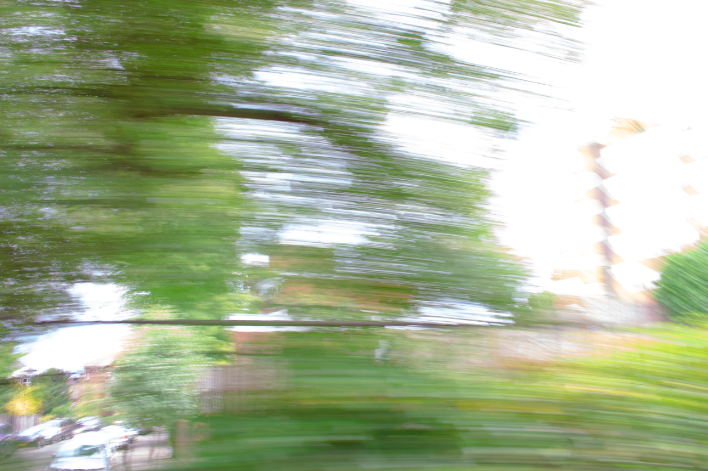
Extension Task: A Journey
In this task I was set to photograph a journey. My journey was in a car, I used a mixture of manual settings and shutter speed priority settings. I like that I used the shutter speed priority, because some of the photos look very blurry which makes the feeling that people never get to see clearly when there looking out the car.
Best edits
In these photos I edited I like that I used a dazed tool which made the photographs looking like a filter. The image on the left, to me looks like a painting.
|

|
WWW: I prioritised my shutter speed to capture movement which I think I did well in. I also like that the photos look like there moving and your on that trip too.
EBI: I do the same thing again but on another journey.
EBI: I do the same thing again but on another journey.
Workshops
Workshop 1: The mirroring and flipping
For this task I was set to choose my own photograph of my own and use photoshop to edit it to make a reflected image. My thoughts on this technique is that it looks completely different from the original photograph, it looks like you could create some sort of animalistic creepy image. I honestly thought creating the reflecting image was slightly hard. On the left there is my original photo and on the right is the finished edited piece.

|

|
Over all I think I did well in the end product but I need to carry on improving in my photoshop work. Because this was quite difficult. I want to try to make a full mirrored photo with out a white line at the top.
Retry


I think I have successfully improved in this re-take as everything in the mirrored image is symmetrical with no spaces.
Workshop 2: Double Exposure
In this workshop task I was requited to use photoshop to create an image of a person with a location overlaid on top of them. Below is the step by step of how I created it on photoshop.
End products

|

|

|
|
|

|


I found this task very fun. Firstly I think I have developed on my photoshop skills which I am not to confident in. To improve perhaps I could use my own photos which could look more independent.
Independent Development:
Strands

|

|
Paul Graham
American night
1998 - 2002
What do you think the photographer's intentions are?
Paul Graham intended to capture the difficult life of the African-American underclass citizens at the beginning of the 21st century. He did this by capturing the African-American citizens in their normal state of living. He wanted us to think about how they are living and how it's difficult and different from your life.
What wider context was your photographer addressing?
In an article about Graham from The Tate website, by Paul Bonaventura, Bonaventura explained what Paul Graham intended to do in his work "American Night". Bonaventura said "a new series of photographs by Paul Graham that addresses itself to the historic legacy of slavery and race relations in America". This is shown by him presenting in his work, a block of ten street portraits of the African-American women and men living in the town he photographed, in the photographs many of whom present to "be suffering from some form of physical or psychological impairment". In the second photo you can see an older woman with a patch over her eye to show that he is hurt in some way. In this picture there are many American ads around her, the ads show how exiting and thrilling America is. This contrasts with her, an only black clothed woman who symbolises depression in the midsts of it all.
(https://www.tate.org.uk/art/artists/paul-graham-2337/blinding-white)
How does the photographer's style of photography and process support their intentions?
In Graham's "American Night" book which contains 63 landscape-format photographs divided into three distinct groups. On of the three groups, the largest group in which consists of 46 bleached-out photos. Graham has used, wide shotted bleached-out images with a small human discreetly in the background, in his work. The lighting is extreamly bright and has a blurr effect towards it. Perhaps Graham captured the photographs with the weather actually so bright to make that effect on his camera or he used photoshop to create low dehaze perhaps.
These people have been treated like they are worth less than white people and they are being seen as worth less. They are not really part of society. America does not allow them to live a happy life. By fading the images of the landscape it's almost as if America is not available to African-Americans. It is not theirs, and it is unreal. Perhaps the reason why the person on the photo is tiny and lonely looking simplifies that these Africa-Americans are all on their own in this situation. In all 46 images there is just one small person captured in it.


|
|
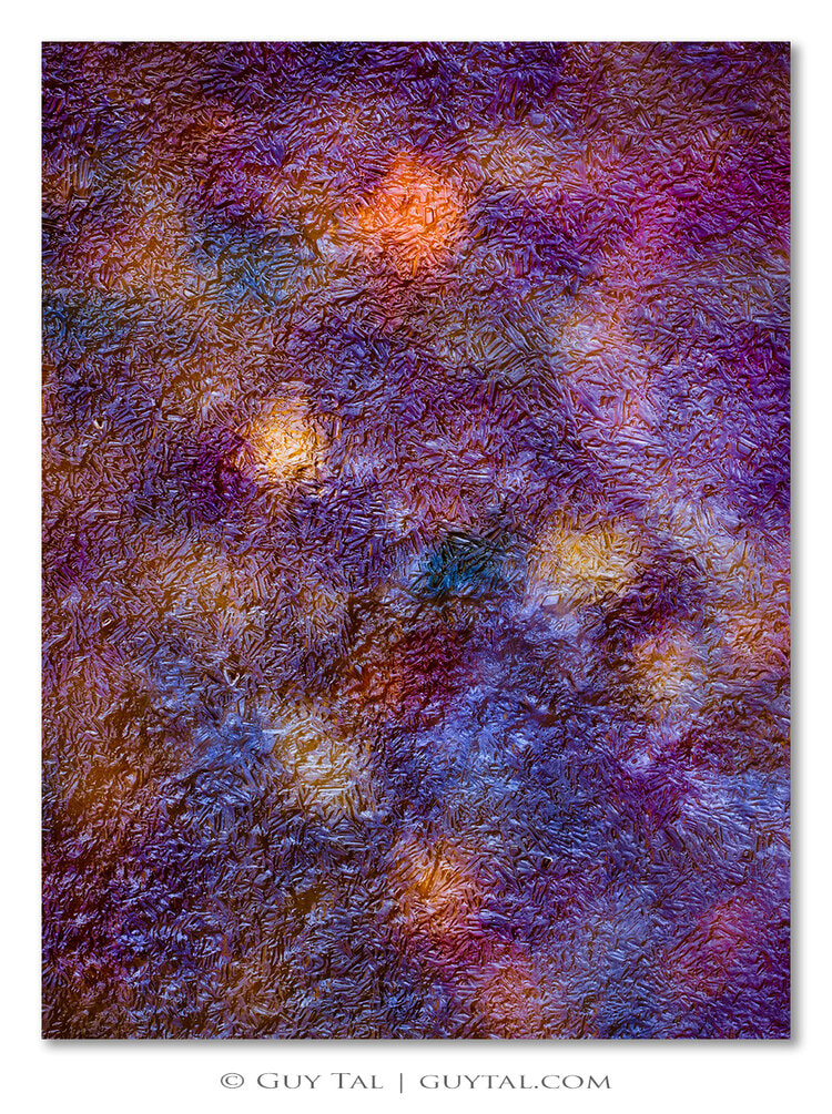
Guy Tal
Vegetative States
What do you think the photographer's intentions are?
Guy Tal intended to make the audience “stop ignoring the variety of beautiful moods, colours, and intricate arrangements created by plants- trees and bushes and shrubs and grasses’. He did this by (sometimes) changing the saturation of the image, which made the image pop out and look much different than it normal form was. He wanted us to react in a way of awe to the beautiful scenery, by making it look unreal and almost like paintings rather than photographs. For example, the top image shows rice plants. But by showing the plants in a closeup and by making the image a bright orange, the plants become one and look like a gigantic firework display. The image is less about the rice plant and more about a pattern, which is beautiful in its own right. And the blue image shows leaves on frozen water. But it is made to look so unreal that we see it as a vibrant work of art, it even looks like plastic or glass more than a regular scene from nature.
What wider context was your photographer addressing?
Guy Tal is capturing "the nature to morph with the weather, and the seasons, and the hours of the day” in his work. This is shown by in the vibrant purple looking photo, the fallen autumn leaves have been trapped over a layer of ice. If the audience didn't know what the photo actually was, they would be in great confusion on what he photographed, like I was. He wanted to explore the cold weather where he was. Also on what stood out by what the cold weather did to the scenery of nature around him. He is showing the viewer that nature is magnificent and has to be admired. Nature is more beautiful than anything people can create. It is perfect all on its own. And we should look after nature and take care of it to continue enjoying its beauty and perfection.
How does the photographer's style of photography and process support their intentions?
Guy Tal said "I consider my work to be expressive art, in the sense that its primary purpose is to offer visual metaphors for thoughts and feelings, rather than to document appearances" in his website. To me, the third image looks like a soft and fluffy carpet that I could lie on. It looks comfortable and inviting. But in fact, it is fallen leaves under frozen ice. It seems that Tal has on purpose made the image more blurry to create this effect. In contrast, the blue image is the exact opposite. It also shows leaves and ice. But here the clarity is so intense that everything looks very plastic-y and unreal. Both ways of photographing this same subject create opposite reactions. His intention is to show that nature is so varied and wonderful.
https://guytal.com/vegetative-states

Yura #339, 2001

Photo Respiration City Scape #272 Koto-ku Aomi, 1996
|

Photo Respiration City Scape #22, 1988
|
What do you think the photographer's intentions are?
Tokihiro Sato’s mythical light-speckled photographs dont show the audience much of how they were made, which would make them more immersed in his work. Sato intended to show light in a scenery, looking supernatural. He does this by using a large camera with long exposure (normaly for 3 hours), and during the exposure he uses a penlight or a hand mirror to beam light towards his camera. Sato's body doesnt appear in any of his work but the light he refects at the camera hints towards the audience that he was present in that landscape.
What wider context was your photographer addressing?
The best way to explain the way Tokihiro is considering is through this article about him (and other light based artists),"Tokihiro Sato give us a strong feeling of space and depth through the process of applying light, even a sense of time". This is shown by the lines and spots of light you can see that he has moved alot especially in the lowest picture I have displayed. The explanation of what he was trying to explore was in his photographs light "breathes in an altogether deeper space." The word "Breathes" signifies that the lights could be people. So Tokihiro turned light into a living being. I think this is clearly shown in the photo on the stairs, the long light lines look like people in an everyday situation.
(https://contemporaryphotographyseminar.wordpress.com/2012/04/04/tokihiro-sato/)
How does the photographer's style of photography and process support their intentions?
The way Tokihiro uses a small mirror or a flashlight in his work to show the rhythmical, melodious like pattern of light. This creates an effect of that the light has its own personality in a way. The way the long squiggles imply that the light can go where ever it wants to go and is allowed to be free. This supports his intentions which were for the light to look eternal and supernatural.
Favourite Photographer
My favourite photographer out of the three I have talked about is Guy Tal. I find Tal's work very fascinating because of the way he transforms landscapes and nature into something diverse and unreal. He makes the audience really ask what he is taking a photo of, because most of his photographs look so different from what he is actually taking. I want to take photos inspired by his work because I also want to show "the variety of beautiful moods, colours, and intricate arrangements created by plants".
First development
Unedited Photos
Edited Photos
I think this independent development went very well. Especially the independent part of it because Guy Tal makes his work look unreal and bizarre but I've made my own twist in my edited work. I have made my images look more alien-like rather than surreal. I like that I've used depth of field in some of my images.
To develop on this task I think I should try take photos of the water just like Tal does, an example is below.
To develop on this task I think I should try take photos of the water just like Tal does, an example is below.

|

|
Second development
In this second development I have chosen on what I said in my last analysis where I will take photos of either the movement of water and the reflections of water. I want to try using different focal points and different depths of fields. I can also explore on colours like my first set of images, also try out how Tal did his colourful close up images too.
Unedited Photos
Edited Photos


|

|

In this second development I have also used saturation like the last task. I think it looks alluring with the contrasting colours.This is actually different to the water photos Tal took because he never used crazy saturation in these specific photos, this shows I have used both tasks in this development. Tal also only used nature in his water photos and I have used nature and infrastructure to create a modern twist. For my next development I want to only photograph nature, water and flowers and make it look like a toxic landscape.
Third Development
In this development I will create a 'toxic' landscape. For example, I will photograph flowers, water and landscape, this will be a mixture of what I have already done. The 'Toxic' part of this task will be in photoshop when I change the colours of the landscape and make the whole photograph look wrong and crazy. I find that the toxic landscape part of this task makes the images appear more like the work of the artist Maciek Jasik rather than Guy Tal.
Unedited Photos
Edited Photos
How I edited
I used the same technique for all my photos.
Faveroite edits


Potographer and me
|
|

|
In Maciek Jasik's Wildflowers work he used and changed the colours throughout all the photos. As you can see in the right photo, Jasik changed the colour of everything except the colour of flowers, perhaps implying he wants the flowers to be the key point that should stay the same. In my photo, on the other hand, the viewer's gaze is directed across the grass and the water towards the opposite shore and the sky. The pink sky sits at the centre of the image, and is the real focus. The focal point of my image is in the back and Jasik's focal point is in the front.
Both images make the landscape look like a fantasy dream or an uninhabited planet. The photo I have picked out above looks the most similar to Maciek Jasik's photo. As you can see, we both photographed vast landscapes with water. Both photographs look wrong in the way that earth isn't coloured like that. I have noticed our photoshop work is different from one another, for example you can see that Jasik's photo looks kind of fuzzy and mist-like where the land meets the water (I looked through other photos of Maciek Jasik and I noticed he has used this haze-like feature in other photos too). And in my photo there is nothing like that, for example the clouds and sky are very clear and not blended in together.
Both images make the landscape look like a fantasy dream or an uninhabited planet. The photo I have picked out above looks the most similar to Maciek Jasik's photo. As you can see, we both photographed vast landscapes with water. Both photographs look wrong in the way that earth isn't coloured like that. I have noticed our photoshop work is different from one another, for example you can see that Jasik's photo looks kind of fuzzy and mist-like where the land meets the water (I looked through other photos of Maciek Jasik and I noticed he has used this haze-like feature in other photos too). And in my photo there is nothing like that, for example the clouds and sky are very clear and not blended in together.
In this third development I think I have created a alluring toxic landscape (in my edited images). I am glad it was the summer holidays for this last task, because I left London and went to many different vast landscapes. Not only the lovely landscapes I got to capture I think I did well in the photoshop work too, I feel like the edited work could be real (on another planet). I am satisfied with the different depths of field I used in some of my photographs. Perhaps to develop on this, I could show a different type of understanding of the word 'toxic' from this third development.
Exhibition Review
Deutsche Börse Photography Foundation Prize 2021 shown in The Photographer's Gallery
This exibition was to show the 4 selected (nominated) photographers for producing outstanding bodies of work exibited or published in Europe during the previous twelve months. All the nominated artists are acknowledged for their major achievements and innovation in the field of photography and contemporary culture. (This was written on the wall at the start of the exhibition.)
About the exhibition
The exhibition started on the 25th of June 2021 and ends on the 26th of September 2021, and on the 9th of September one of the nominated photographers will get a prize of £30,000. There were 4 photographers shown- Zineb Sedira from Algeria (born in France), Poulomi Basu from India, Alejandro Cartagena from Mexico and Cao Fei from China.
There were two floors for the exhibition, two photographers for each floor, and on each floor there was one room for the photographers. There was no guide to show people around the exhibition, it was very simple. Zineb Sedira, Poulomi Basu and Alejandro Cartagena were presented in interviews, talking about their exhibitions. I didn't to see Cao Fei in an interview but I got to see a short film she created which is connected with her exhibition, which was about 'the digital world as a utopian space'. Poulomi Basu also presented a short film called 'Ghost Dance', which is about "a feminist's narrative that imagines that the only survivors of this ecological holocaust are a group of women sent out into the cosmos - a final act of survival". I will talk about Poulomi Basu's in more depth later.
Throughout the whole exhibition there were books about the photographer's works, interviews on the photographers, short films, short introduction paragraphs about the artist (shown on a wall) and even evaluation papers (of who should be the winner) from the people who came to the exhibition. All of these devices were to add interest to the viewers.

Zineb Sedira interview

Cao Fei Short film 'Nova'
|

Alejandro Cartagena interview

Poulomi Basu interview
|

Evaluation papers from viewers
|

|
Poulomi Basu
-Chosen Photographer
The Deutsche Börse Foundation describes Basu's book 'Centralia' as a sophisticated and complex body of work that "uncovers the violent, largely unreported, conflict between a marginalised community of indigenous people (who live deep into the forests of central India) fighting under the People's Liberation Guerilla Army (PLGA) and the Indian state." Poulomi Basu started this body of work in 2010 and is ongoing, also she created her short film 'Centralia: Ghost Dance' in 2021.
"Engaging with intersectional issues of feminism, race and class, environmental and climate justice, Basu's project exposes the devistating impact of poverty, conflict, ecological deprivation and patriarchy in her home country and around the world". She photographs staged portrates, violent crime scenes, testimonies and mugshots of fallen,often female, revolutionary-fighters as well as depictions of traditional rural festivities. She includes dark landscapes in her work, where she uses double exposure.
The foundation explains that she often mixes fact and fiction, using multilayered (perhaps meaning using double exposure), visual storylines to portray complex, contemporary realities. This shows her approach to "challenge the limitations of traditional documentary photography and advocates against political and social industries."
In her trans-media project 'Blood Speaks: A Ritual of Exile' (investigates the causes and the consequences of normalized violence against women in Nepal) , which was created in 2018, she says it "has ended up in a policy change, and changed the law". This big step in process (through her work) made Basu feel that her not only being an artist showing her work through art galleries and festivals, but she can also take her work one step ahead- to be able to change communities lives.
But going back to her work 'Centralia', her intentions are to give a stern warning of the great numbers of serious threats to the future of our global society, which includes "engaging with intersectional issues of feminism, race and class, environmental and climate justice".
Photographs of her exhibition
Other artists
Cao Fei
Zineb Sedira
Alejandro Cartagena
Favourite Photos

I like this photo by Alejandro Cartagena because it is showing a story. Moreover there is beauty in the composition as you can see the straight lines everywhere, its like a geometric pattern. I think the photographer is very clever by capturing this photo in bird's eye view, because he is making the people the key subject of the photo. Everything is dark around the men, this visual beauty is something the viewers can appreciate. But if you go deeper in the photo, you realise what is actually happening i.e. poverty and desperation. You can see that these people in the photo are uncomfortable, and so I thought that the viewer would also be uncomfortable looking at this photo. Because the exhibition visitors are able to drive in their own car and able to enter a gallery just to look at the opposite of themselves.
|

I like this photo by Poulomi Basu too. The double exposure is also telling a story to the viewers. It looks like the same girl in both of the photos, one smiling and standing up and in the other photo her perhaps unconscious and being held up. Prehaps these photos were taken on the same day. The photo also makes me want to search up what happened or ask the photographer, so I know what happened.
I feel that there is also an emotion to this photo, it makes me/the viewer feel sympathy for the girl and worry for her fate and future. |
Conclusion
To conclude I liked the whole exhibition and all the artists. I enjoyed that all the artists were telling or informing stories through their photos and films. And if I wrote one of the evaluation notes I would have said that Poulomi Basu should win the prize. Because she tells us a powerful story through her work. She shows us the real life and struggles of women in her home country. The images are moving, upsetting and thought-provoking. I like how she would rather show than tell. Her images are stronger than words.
Once you have seen something you cannot un-see it.
Once you have seen something you cannot un-see it.
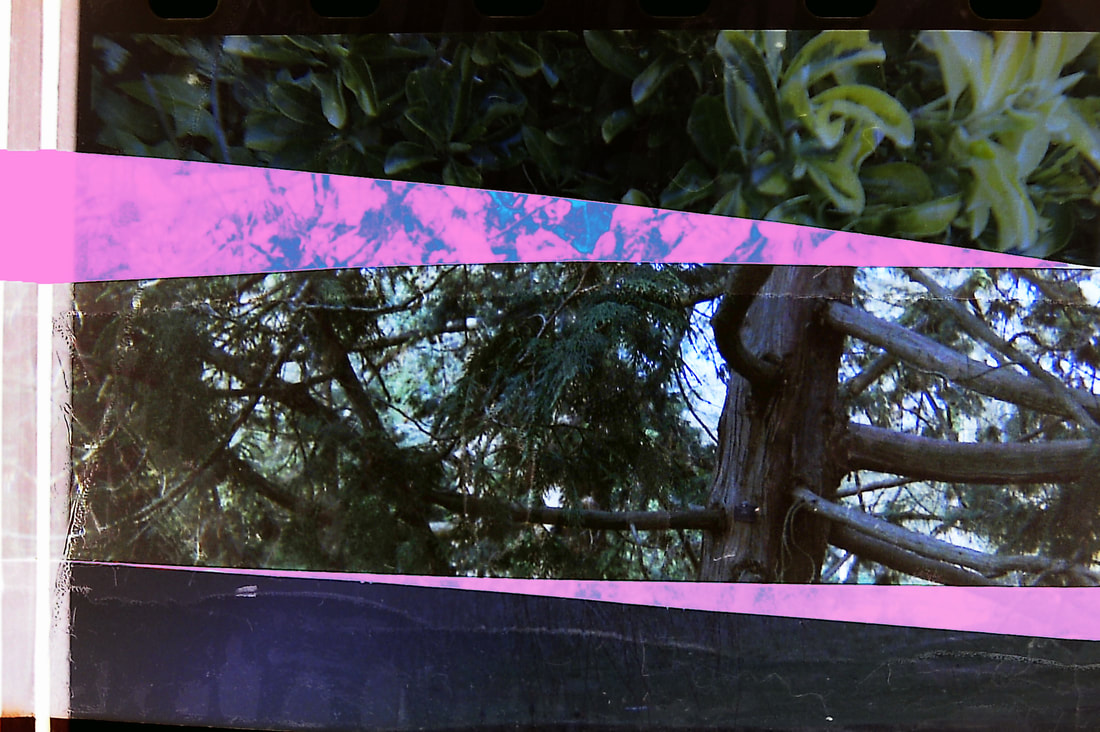
Fourth Development
For my fourth development I chose to create a piece inspired by Dafna Talmor. She creates images from collaged pieces of negative. In her work you can see parts of the image as it should be (realistic), then the torn and cut edges that look toxic. I think this different version of a 'toxic' landscape could portray my understanding even more.
Instead of using negative, I will be using acetate which I cut out to make a similar representation of Talmor's photos. I collaged different landscapes, I photographed, and then stuck those cut out pieces on white paper.
After that I went onto Photoshop, where I tryed out overlaying different collages which is called double exposure.

|

|
Unedited photos
I chose these photos from development 3 to collage and cut it out, I chose these photos because I wanted them to contrast with each other. Some were edited and some were not. I aimed to make odd pieces, some sharp and some round, thin and think. So that nothing looks like it is meant to be together.


Final edited photos
Throughout this photoshop work I explored different elements on photoshop. For example changing the hue and saturation, also lightening the image and using a black and white filter. I wanted all images to look different to each other but still all look toxic.


Photographer and me

|
|
I find that Dafna Talmor's work is different to my work. But we created different representations of somewhat the same thing. As you can see in the left image, Talmor does not use any colour adjustments on photoshop, whereas I have (on the right image). But in both of our photos we cut and collaged the image of a place (or in my case, two places). People who would look at our images would have to really focus and search to see what both the collaged images were before they were cut up.
Around Talmor's cut images of negatives there is a hint of brown and yellow colour. I like this in her image because it makes the image look almost burnt. It gives the appearance of something hopeless and dystopian, like a world that has been destroyed.
Since I used a digital camera, I did not have any negatives of my images. That's why I chose to make my images overly coloured. So, it is toxic in its own right, but in a different way from Talmor's work. To me, it shows a world that has gone wrong and where flowers are not beautiful and peaceful any more, but somehow eerie and dangerous, like in a psychedelic nightmare.
What I like about Talmor's image is that she placed the darker pieces on the lower part of her image and the lighter pieces toward the top. This gives the appearance that it's a wholly new but still natural world which still has a sky. My image, on the other hand, is more scrambled and looks a little more aggressive, like an explosion. But I think this works well because of the blue and purple colours in my image.
In this final development I think I have completely understood and shown a different representation of a toxic landscape. Next I want to use actual Negatives and see how different it would be from the acetate.
Interim outcome
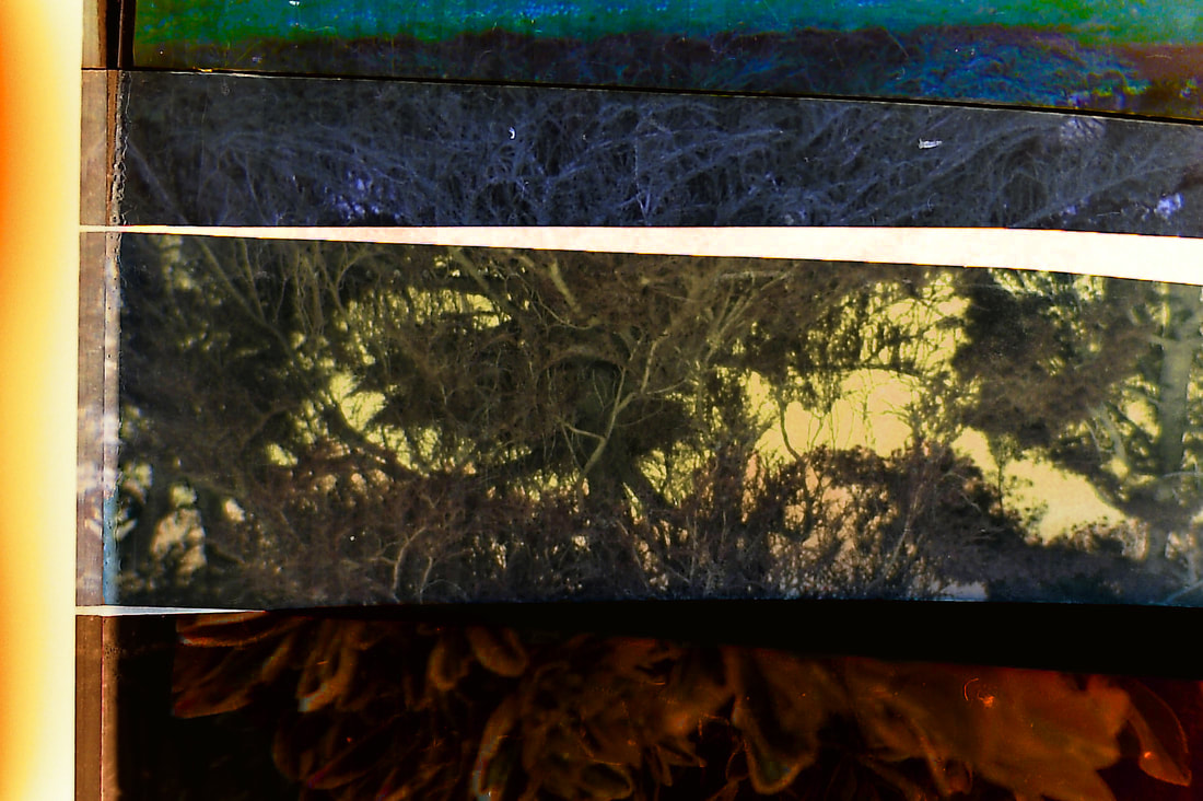
Fifth Development
In my fifth development I used a disposable camera and took photos of landscapes. The reason why I used this specific camera was so I could get the negatives after the photos get developed. So I went to a huge nature park called Kew Gardens where they have greenhouses of plants from all over the world, and also they have normal English landscapes. I tested photographing into the light to see what the negative would look like.
In contrast from the last development my images are not chaotic and cluttered but the images are in straight lines and looks more neat.
In contrast from the last development my images are not chaotic and cluttered but the images are in straight lines and looks more neat.
Making process
Scanned images(Unedited)
In the disposable camera I was limited to take 27 photos. Which meant I needed to carefully take my photos. So I took a range of close and far away and water photos to sum up my whole project (as I used those angles in my past developments). The day I took my images the weather was not sunny so the overall colour on my images that came out was dark looking and colourless. I was aiming for this though, so that when editing it will become more colourful and poisonous looking.
I chose to arrange the images in rows so that it looks neat and contrasts with my last development. Also arranging the images was completely random, as I couldn't identify each piece of the negative films (because of the colour and size). Moreover while organising the layout of the pieces I wanted there to be spaces of black (where you don't overlay any negative) and spaces of white(where you overlay negatives). Because I liked how it looked. I wanted there to be small differences in each of my photos, so that's why some I overlaid the images more and others I overlaid less.
Through these images and collaging them, I am trying to show how beautiful nature is to our world. And that we should look after it more as it is also contributing to keeping us humans alive.
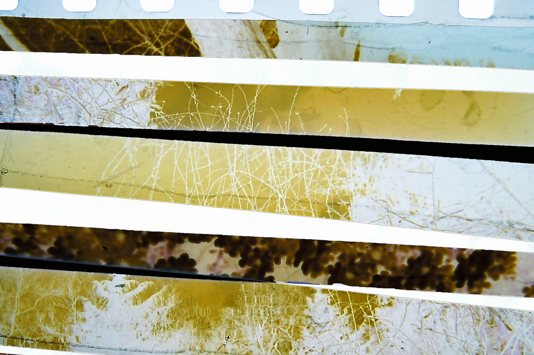
Edited
In the editing process my intensions were to make the plants to look poisonous and toxic, through the interesting changes of colours. It is to raise awareness of how people poison their landscapes and don't think enough about it. For many images I edited I selected one strip each and edited them.
I am overall very pleased with my final development. I like the way the strips each showed different plants, yet by altering the colours in Photoshop I managed to pull the image together to create something new and abstract - a toxic, uninhabitable world. I think this technique makes the image very compelling - there’s so much to discover. It’s the strong graphic elements that draws the viewer in first. Then, by looking closer they can immerse themselves in the next dimension - the toxic plants. The disposable camera gives the images a vintage feel, which I think makes the end product appear even more eerie and almost nightmarish. I’m very pleased with the result and I believe I can't develop on this as it is the best outcome.
Final piece